Towards an Atlas of 15th Century Typography
This is a short note on a Work in Progress, an explanation: why I am creating an overview of early modern typography, what I am doing and how I am doing it. My workflow will of course change over time and I would like to invite readers to comment and of course to suggest improvements.
What is it about?
My interest is in typographical innovation. How did printers and publishers in about 50 years create the book as we know it – the Machine à lire that brought order to a text and gave access to information in an unprecedented way. Most medieval manuscripts were meant to be read and re-read, the authorities mentioned in any text a stock of ever returning characters. This changed dramatically in the half century after Gutenberg. Millions of copies were sold and new authors abounded. The title-page with clear information about the author, the title and information on the bookseller replaced the unassuming incipit and colophon, notes in the margin referred to other books, at first to an author, then to the title and eventually also to the edition. How did the book evolve to something we now recognize and in which we can find our way without effort?
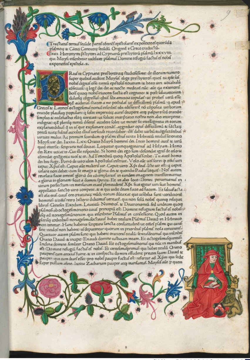
A mechanical produced medieval manuscript from the presses of Conrad Sweynheym and Arnold Pannartz. [Hieronymus. Epistolae. 1470, USTC 994339]
On the technical side the hand painted initial and hand colored images were replaced by print, making the process of producing a book both quicker and cheaper.
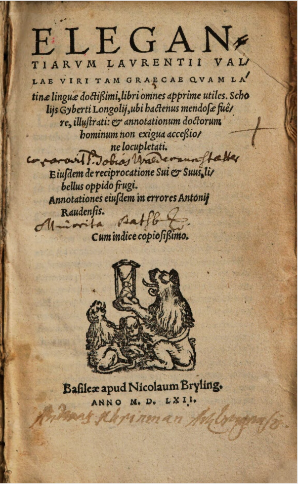
A title-page from 1552. Although it does not look familiar we can interpret it without much effort. The same goes for the content. Lorenzo de Valla. Elegantiarum Laurentii Vallae … opusculum. Basel, Nicolaus Brylinger, 1562. USTC 648902
The Map of Early Printing, created by Greg Prickman shows how little time it took for the printing press to spread all over Europe. Printing was complicated and expensive and this makes the fast acceptation surprising. The slow acceptation of innovations that were both simple and clearly profitable on the other hand seems rather odd. It took years before the historiated initial was finally replaced by its printed counterpart. The title-page also took years to become the fully fledged page we all know. This goes for every aspect of the paratext. To follow the history of all of these aspects is not only interesting for historians of typography or even the history of ideas. It will tell us something about how innovation works in every field of human activities.
The Method
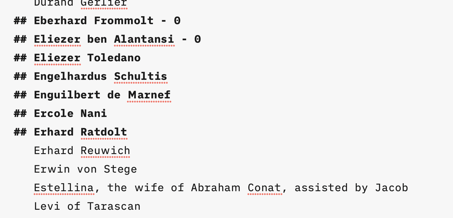
The first step in my research was to compile a list of all known printers and publishers. The ISTC does not have a thesaurus and I decided to create a list simply by going through all the records in the ISTC, place by place. Once compiled the list is compared to catalogues, indexes and so on. This is a work in progress. It looks like this:
The ## means that I have looked up the name in the USTC in search of a digital copy that is usable as a source for the Atlas. In time I will publish my opinion on how libraries present their digital collections on the internet and which libraries are linked to screens like this one:

Some libraries are hampered by systems that try to do too much or do too little. There are libraries that paid a lot of money for systems that must have seemed top of the bill but today look outdated or simply unusable while others seem to have closed down part of their online collections. When I have finished this project, I hope to go into that.
Why do I use the USTC instead of the ISTC? The answer is simple: just give both systems a try and then you know. The USTC gives the possibility to pre-select digital copies. A lot of the results end up in dead ends or on websites that are unusable for my purpose but that goes for the ISTC too. But the ISTC requires me to click through three separate pages to find out if a digital copy is of use while the USTC does not.
Once found I take a simple screenshot and add the record number and a copy of the impressum to the image. Images: the binding if I find it interesting, all traces of medieval manuscripts in bindings, examples of old annotations and of course 4 to 10 examples of pages. I use Lyn to add these simple metadata:
The images are stored in Flickr for further use and so that those interested can follow my work in progress. It looks like this:
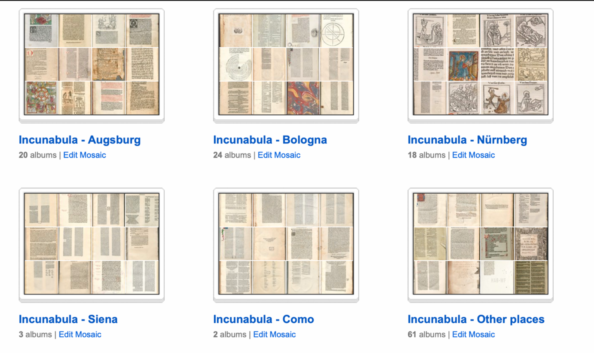
Collections are organized by place.
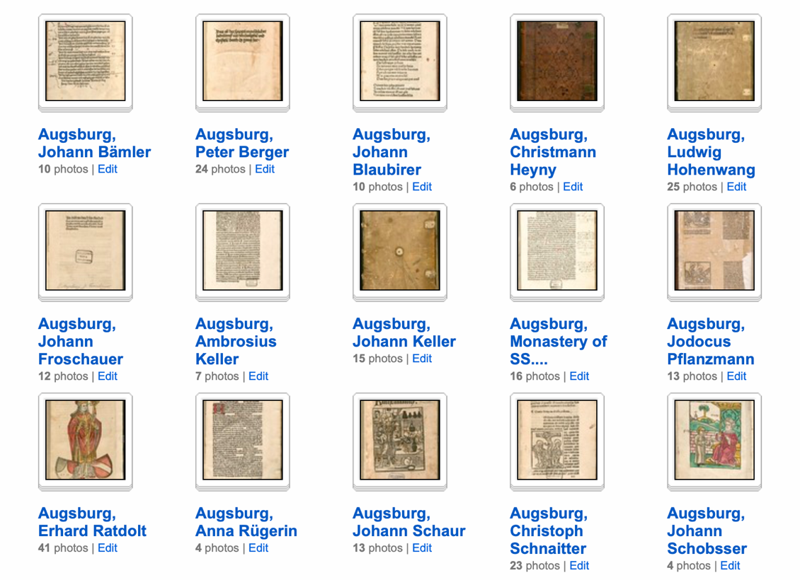
Each collection is divided in albums.
The new Photo program on my Apple computer makes it easy to add further keywords to images (historiated initial, annotations, headers and so on) – but that will be done later.
My friend Etienne Posthumus designed a system that makes it possible to create Metabotnik images on the fly (Metabotnik.com) and that will be used to show collections of images that are selected using metadata. (see: metabotnik.com to find out what I am talking about)
This are two stills of the Paris Gutenberg that show how incredible the zoom is. You go from the overview to the smallest detail in a second.
And then there is the map. Etienne Posthumus (again) created a system that uses a map to give access to information, any kind of information, with the ability to use a timeline and zoom. At this moment it contains all printers and publishers in Amsterdam up to 1800 but we plan to extend it to Europe. The spreadsheet that feeds the map is in place and so are the geographical references. The pop up is connected to information elsewhere on the net. It may be a blog, a text on Wikipedia and of course the Atlas of Typography.
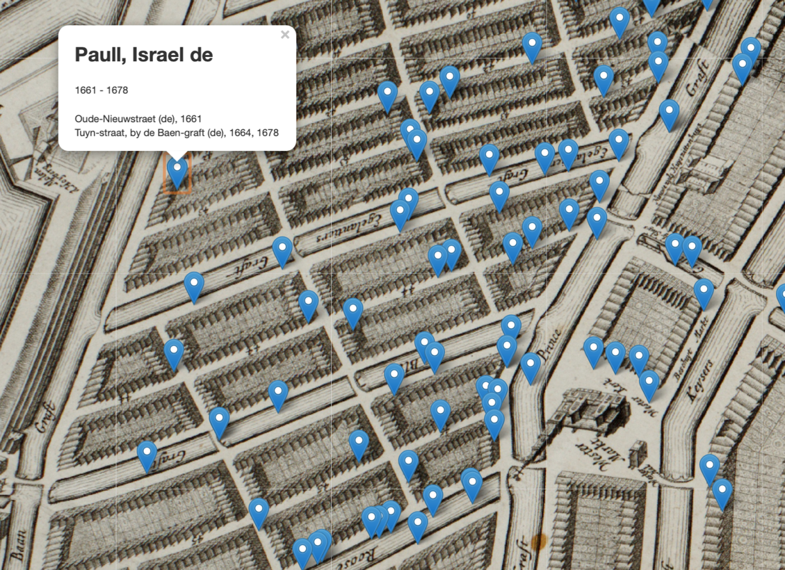
The Jordaan in Amsterdam, with the caption printer Israel de Paull, recently discovered to have printed the works of Spinoza (by Trude Dijkstra and Rindert Jagersma)
This all may seem overambitious but thanks to the work of many librarians, programmers and the internet it can be done. What used to take weeks now often requires a few minutes to do - and will be done.
[Paul Dijstelberge]