Gauffering the edges
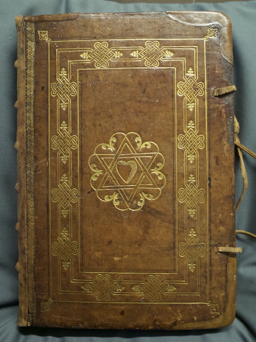
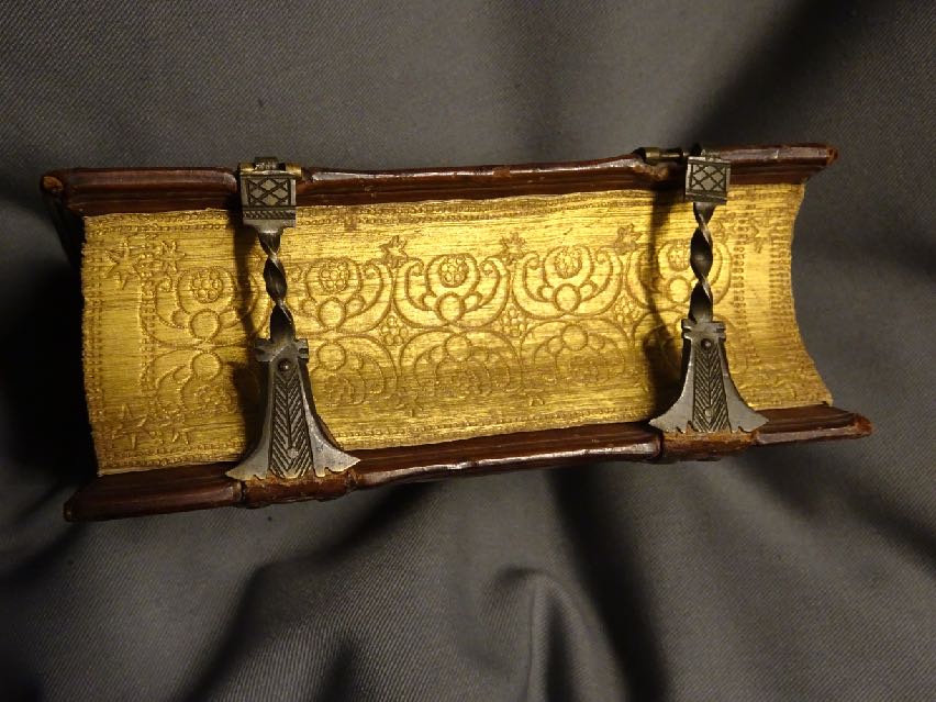
Desiderius Erasmus, In novum testamentum annotationes. Basileae: in officina Frobeniana, 1542. In-2. OTM: Band 2 A 6.
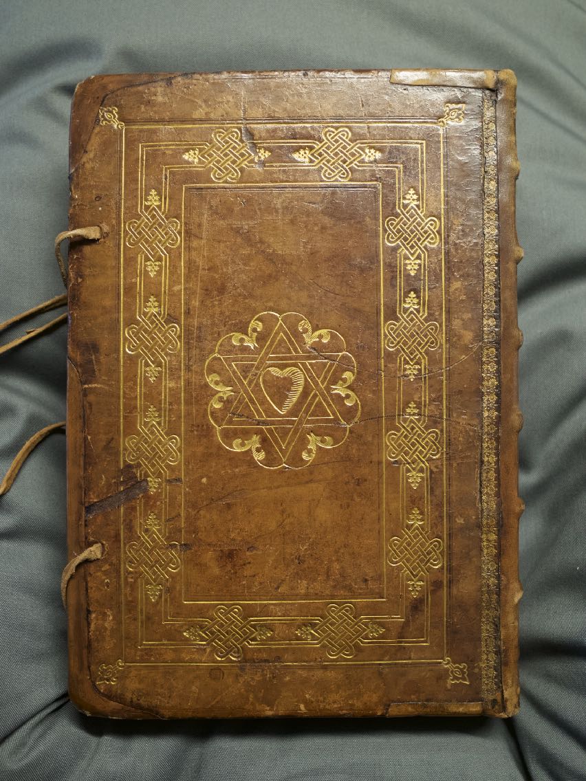
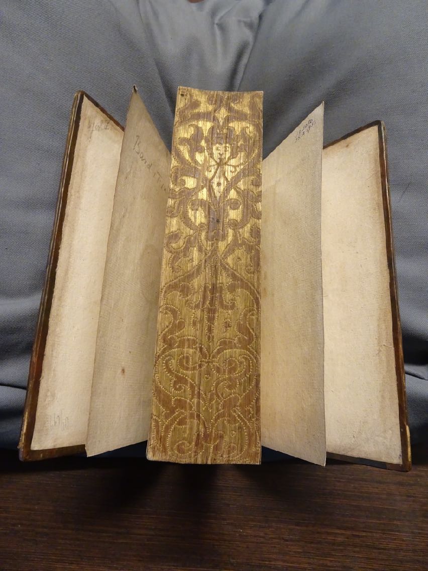
Although this is a beautiful, gold decorated binding in its own right, another good reason why Band 2 A 6 ended up in the Bandenkast is the edges of the book-block, which are elaborately gilt-gauffered.
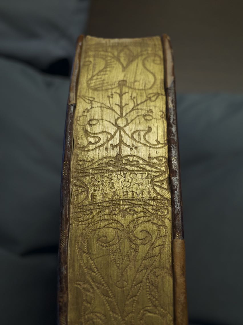
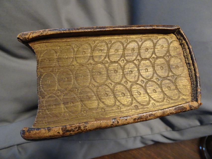
Tail-edge gauffering of ‘Annotatio Erasmi’, the title and author of the work in Band 2 A 6
Gauffering is a dotted decoration made by repeatedly impressing a pointed tool into the edges of the book-block. Usually the edges were first gilded or painted with a colour, mostly black or red, but another colour or uncoloured is also possible. The dotted decoration may range from simple rows or seemingly random curves to finely executed patterns, leafy and floral designs, figures, legends, and ownership marks such as a device or initials. Sometimes the title, author and publication or binding date are applied, which is the case on Band 2 A 6 where the abbreviated title and author are gauffered on the tail-edge and the binding date on the fore-edge. The direction of the lettering ‘Annotatio Erasmi’ on the tail-edge indicates that the book would have to be stored on its spine, with the tail-edge outwards, to make identification possible. Why and where was this done? Italy? Germany? Strange, very bad for the spine, which has indeed been restored.
Covering the edges of the leaves with colouring and decoration started in the early Middle Ages, when manuscripts were stored flat, with only the edges exposed when they lay stacked upon each other. The application of distinguishing marks on the edges was not only decorative but also practical, as it would facilitate finding a sought for work in a pile of manuscripts. Gauffering was handwork, as a result no two gaufferings are the same. In the 16th century gauffered edges also became popular for printed works. From the 17th century onwards, the decoration became less elaborate with more simple dotted lines and less imagery, and was gradually limited to one of the book-block edges. Gilt edges without gauffering have remained popular until now, mainly for luxurious editions and religious works.
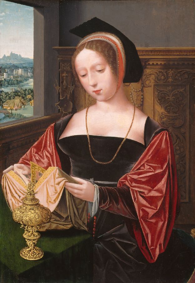
Mary Magdalene reading her book with gauffered edges. Saint Mary Magdalene c 1530. Oil on canvas. Master of the Female Half-Lengths. Art Institute Chicago.
24 of the 90 bindings in the Bandenkast have gauffered edges, the edges of 21 are gold, two are black and one red. To have the edges gilded was obviously a more costly choice than painted edges, the addition of gauffering even more so as it involved intricate craftsmanship. Gilt gauffering is therefore generally found on the more luxurious bindings for wealthy patrons. Even though they do exist, there are no bindings with gauffered lozenges or triangles reminiscent of the Middle Ages in the Bandenkast. The bindings with gilt edges all fall into the luxurious category with foliage and flowers, images, circles and dots, the bindings with painted edges have a more austere decoration.
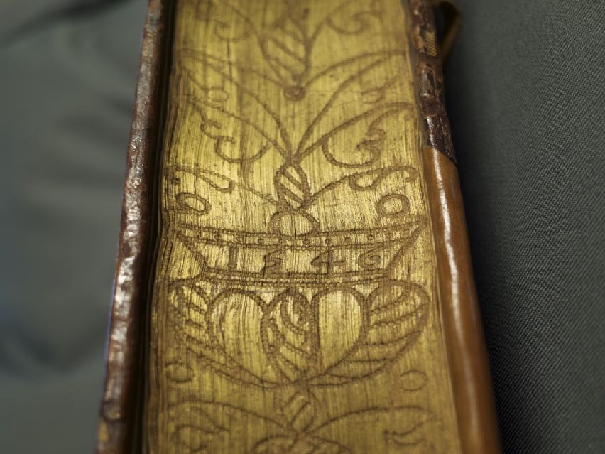
Presumably the date of binding ‘1546’ gauffered on the fore-edge of Band 2 A 6 printed in 1542.
Foliage and face gauffered on the fore-edge of a theological work by Jean Calvin, printed in 1558. Band 1 F 14.
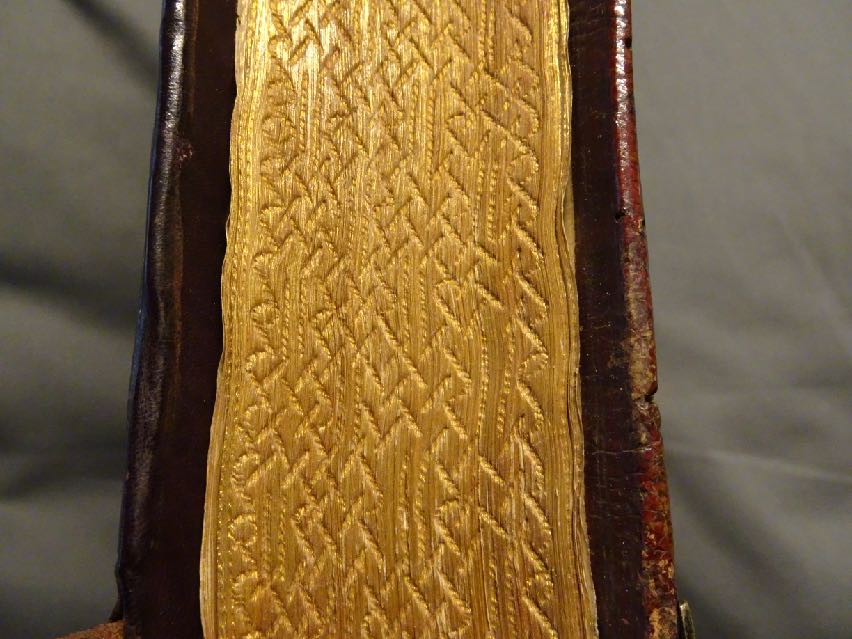
The gauffering on this binding is different from the three above, which have a more traditional decoration. This design is desceptively simple, however a closer look reveals an intricate, interlacing pattern. On a religious work printed in 1557. Band 2 A 3.
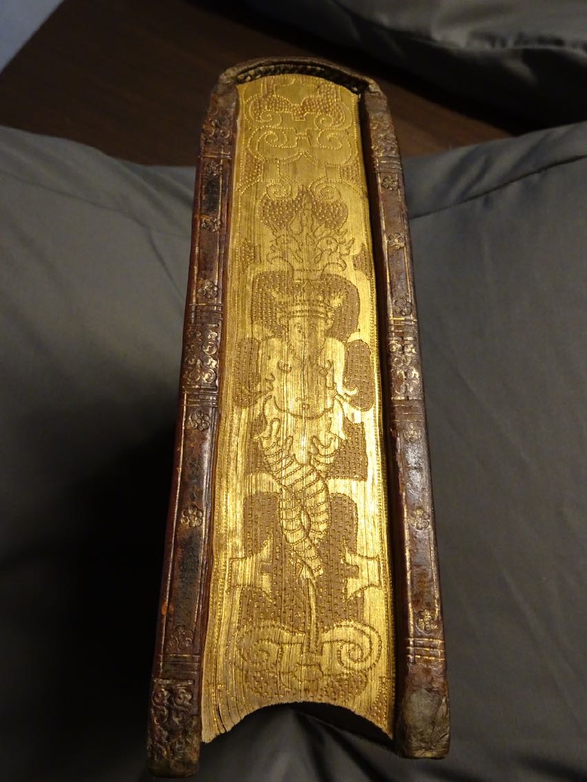
This is probably the finest gauffering specimen in the Bandenkast. On the tail-edge of a binding from the school of Urban Köblitz (active 1571-1574). Contains a theological work printed in 1567. Band 2 C 5.
Stars and more, on a religious work printed in 1598, the binding is dated 1598. Band 2 E 1.
Derolez places the gauffering of circles with dots c 1600-1650. This is a Dutch bible printed in 1599. The binding resembles Band 2 A 6 in more than one way. Band 3 B 1.
Finally, one of the ugly ducklings, a most interesting item. It is the only example in the Bandenkast with decorated red edges. The ornaments are a throwback to early Renaissance, with its arabesque tools and fleurons, however they are not made up of dots like the examples above, but are stamped, in black, on the edges, to resemble gauffering. There are some other curious things about this binding.
A historical work printed in 1570. Band 3 A 8.
For future reference
The research by Derolez 1984 is based on examples from The Low Countries and Germany of which he also includes images, this is welcome comparison material as not much has been published about gauffering. Derolez mentions dots having different forms, that seems worth looking into. The same goes for the connection of the decoration on the binding with the gauffering of its edges.
The use of gauffering?
The edges of a book are prone to gather dirt. Gilding or colouring the edges was supposedly a method to protect them. This may be true about the simple gilding or painting of the edges, which results in a smoother surface, but it seems gauffering defeats the purpose. The indented dots catch dust instead of protecting from it, and for the same reason the gauffered edges are more susceptable to wear and tear. What started out in the Middle Ages with gauffered titles or other identifying symbols as a practical way to organize a library of manuscripts, evolved in the 16th century and onward into an expensive decoration. To connect gauffering as decoration more securely to the 15th century we would like to find some 16th century bindings with gauffered lozenges and triangles on its edges. Derolez has them in his research collection, there are certain to be some at the University of Amsterdam too.
Related bindings
University of Amsterdam - Bandenkast 1500-1600
24 of the 90 bindings have gauffered edges
Band 1 A 7. Black. Leafy. Floral. Date.
Band 1 C 15. Black. Interlacing.
Band 1 E 14. Gold. Floral.
Band 1 E 15. Gold. Floral.
Band 1 F 14. Gold. Floral. Figure.
Band 1 H 13. Gold. Geometric curling.
Band 2 A 3. Gold. Geometric.
Band 2 A 6. Gold. Floral. Author and title. Date.
Band 2 B 5. Gold. Dots.
Band 2 C 5. Gold. Decorative. Figure.
Band 2 D 2. Gold. Curves. Lobed.
Band 2 E 1. Gold. Floral. Stars.
Band 2 E 10. Gold. Dots.
Band 2 F 13. Gold. Undulating.
Band 3 A 1. Gold. Undulating.
Band 3 A 8. Red. Arabesque. Floral.
Band 3 A 18. Gold. Interlace.
Band 3 B 1. Gold. Circles.
Band 3 B 22. Gold. Floral.
Band 3 C 1. Gold. Curves.
Band 3 C 12. Gold. Leafy.
Band 3 D 7. Gold. Leafy.
Band 3 E 20. Gold. Geometric.
Band 3 E 29. Gold. Floral.
Provenance
University of Amsterdam. Bought from the estate of Arnold van Bottenburg (-1967) 11-11-1970 for Hfl. 1.049,76
Sales and catalogues Band 2 A 6
None
Bibliography
OTM: Band 2 A 6 at the University of Amsterdam
Description of Band 2 A 6 at bandenkast.blogspot.com
On the decoration of book-edges
Frederick A. Bearman, Nati H. Krivatsy & J. Franklin Mowery, Fine and Historic Bookbindings from the Folger Shakespeare Library. Washington: The Folger Shakespeare Libary, 1992. p. 145-159.
A. Derolez, 'La tranche dorée et ciselée d'après les collections de la Bibliothèque de l'Université de Gand.' In: G. Colin (ed), De Libris Compactis Mischellaniea. Bruxelles: Pierre M. Gason Aubel, 1984. Studia Bibliothecae Wittockianae 1. p. 251-272.
Edith Diehl, Bookbinding it’s Background and Technique. New York: Dover Publications, 1980. Two volumes in one. p. 168-171.
Mirjam Foot, Bookbinders at Work. Their Roles and Methods. London/Delaware: The British Library/Oak Knoll Press, 2006. p.68-76. Plate 85.
Language of Bindings. Ligatus.org.
P.J.M. Marks, Beautiful Bookbindings. A Thousand Years of the Bookbinder's Art. London/Delaware: The British Library/Oak Knoll Press, 2011. p. 60-63.
[Pam van Holthe]