Arranging love and other tumultuous feelings: four copies of the Latin love elegists
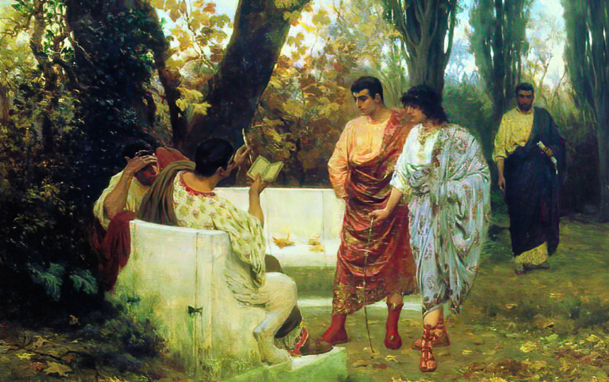
“Love for love’s sake” and “A love liberated from any intend besides enjoying another human being’s presence” sound like modern principles that were unthinkable in a past where marriage was done to elevate one’s status and wallet, not one’s disposition. It is however a phrase that still most accurately summarises the epos of the Latin love elegists, a group of Roman poets who composed their work, about twothousand years ago. Gaius Valerius Catullus (84 – c. 54 BC) is usually seen as the herald of this genre.
With his reflections on his turbulent affair with Lesbia, he sets an example followed by equally infatuated (or pretending to be so) poets such as Tibullus, Propertius and of course Ovid. Although immensely popular in Antiquity, Catullus himself wasn’t much read through the middle ages. Only in the fifteenth century did he become popular again. Catullus was usually sold side by side with Tibullus and Propertius, both as manuscripts and printed editions. Readers could enjoy approximately two hundred poems about one of the most essential parts of the human condition: love.

A book that contains about two hundred poems needs a system to make it accesible. I picked one manuscript and three printed editions (Vindelino da Spira’s 1472 first edition, Bertochus’ 1481 edition and Mazalibus’ 1481 edition) to find out how they organise this compilation. Every book was coincidentally written or printed in Northern Italy. Each one also displays Catullus alongside with Tibullus and Propertius. I will discuss the manuscript, followed by the printed editions.
[1] Lat 8233. Paris, Bibliotheque Nationale. Catullus, Tibullus and Propertius. Italy (Florence), s xv (1465) Gherardus Cerasius
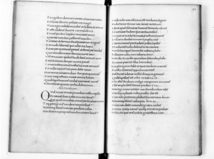
The first thing that attracts attention when looking at the manuscript and printed editions side by side is the size of the manuscript. With its 230x153 mm, it is substantially smaller than the printed editions presented here. The manuscript contains about ten lines less per page, making the script seem larger and creating more space between the lines. This increases legibility and gives the folio a more balanced look (figure 1). This is enforced by the scribe Gherardus Cerasius who chose to start every line at the same point, which makes the pages look more composed. The printed editions on the other hand elected for alternating starting points of the lines, possibly to illustrate the two different rhythms of the elegy (the hexameter and the pentameter). This creates a more dynamic page. Another result of a smaller page is that the manuscript has more pages than the printed edition.
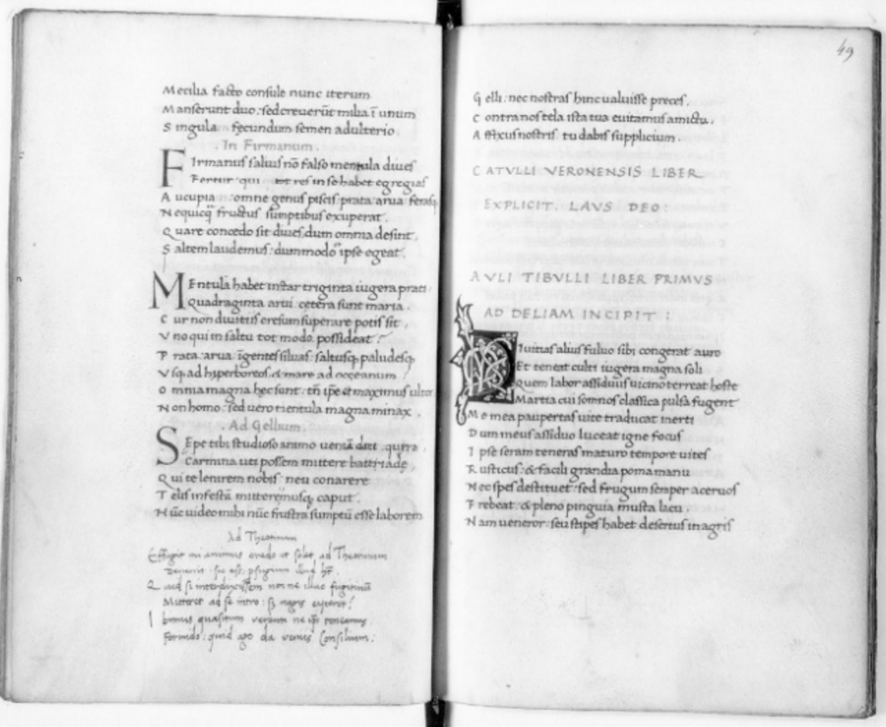
The second way in which the manuscript manages to organise its poems is using illuminations. The manuscript consistently uses red ink, capitals and so-called incipit and excipit signs to signify the beginning of a new part. The poems are titled. These are centred and coloured red to make them stand out from the text block. The first initial of a part is also more decorated than the initials that decorate each poem, to make the text easier to navigate. These bigger initials are four lines high and illuminated with a complex design of white vines, while the smaller initials are only two lines high and simply red or blue. The printed editions are different. They do not use bigger initials, nor do they use different colors to illustrate titles. What they did consistently do, was centring their titles to make them stand apart from the text block.
[2] 990385. Tibullus, Albius. Elegiae.Catullus: Carmina.Propertius: Elegiae. Reggio Emilia, Albertus de Mazalibus, and Prosper Odoardus, [13 September] 1481. This edition elected for two alternating starting points of the lines.
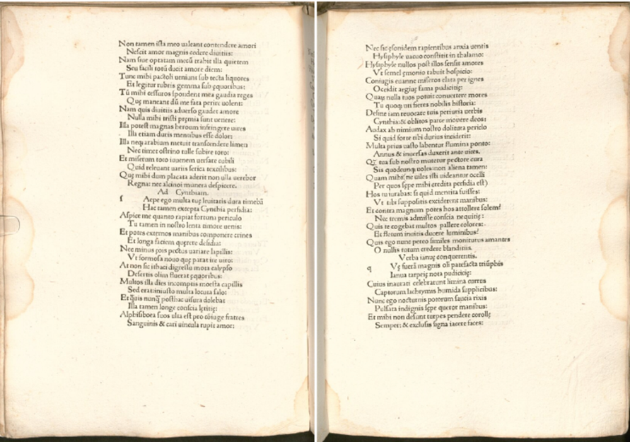
Even though the three printed editions seem very similar, one may notice some peculiar differences. Starting with the size of the books again, you will see that both 1481 editions are taller, with wider side margins on the left than the 1472 edition. Because of this, these editions were able to cram 45 lines in a page instead of the 1472 edition’s 35 lines, making the poems more economic to publish yet taking away some of its articulateness.
Concerning legibility, the three editions all seem to use the same arsenal of part and poem signifiers as the manuscript, even though they do not always apply them as consistently. Take for example the different ways of signifying the start of a new parts. The 1472 and 1481 editions all use more or less the same cue: introduction, incipit and excipit, and open space for initials (that were supposed to be added by hand). The three texts seem to have the same introductions for each author. Except, when you put all three of one edition’s introductions next to each other, they turn out to be rather inconsistent. The words may be more or less the same but they can be abbreviated in totally different ways. The 1481 Mazalibus edition has the titles: Albii Tibulli eq. Ro. Poete. Cl. Liber Prim quod spretis divitiis & militia Deliam amet & amori feruiat; Val. Catulli. Vero. Poetae Cl. Ad Cornelium Galum; Propertii Aurelii nautae poetae clarissimi Elegiographi. Liber. Primus. Ad Tullum.
The printers used two different spellings for poet and two different ways of writing “clarissimus” in one edition. Not only the beginning of either three books can look a bit different in one edition, the ending of a book doesn’t necessarily state the same either. Looking at the 1472 edition by Vindelinus de Spira himself, you will find that all books have a different variation of “explicit”: for Catullus “explicitus est”; for Propertius “finis”; and for Tibullus “telos”. The 1472 edition isn’t the only one. The Mazalibus’ 1481 edition also has three different ways of saying “the end”: the ending of Catullus is signified with the words “explicit” while Propertius’ book ends once again with the word “finis”, Tibullus’ book just ends without a word to herald its completion.
How inconsistent the signs of beginning and ending in a book may be, the printed editions do manage to keep their poems from bleeding into one another. All poems are titled and each title is centered to make it stand out from the text block. The Bertochus print is the only one who used capitals and red paragraph signs to make the titles even easier to spot. The other editions printed titles that weren’t in any way different from the rest of the text. The beginning of a poem can also be recognised by a blank square of two lines where an initial should’ve been. However, only the letter that the initial should represent is printed.
[3] lat 8233. Paris, Bibliotheque Nationale. Catullus, Tibullus and Propertius. Italy (Florence), s xv (1465) Gherardus Cerasius. The different ways of categorising text in a manuscript.
Keeping over two hundred poems organised is a job that requires a solid system and consistency in keeping that system. Manuscripts containing the Latin love elegists are handwritten pieces of art made with a client in mind. That client has the power to choose the arrangement and decoration of the different categories in a book. Printed editions, on the other hand, are made in bulk for the market. They use the framework of a manuscript but try to eliminate the costs as far as possible. These works are still practically hand-made and they can get inconsistent when flipping back to the beginning of a book isn’t always a possibility. Further research should conclude if these inconsistencies are also common in later times. For now I consider it enough to look at some of the prints that made the love elegy popular again.
[Larissa van Vianen]
Paris, Bibliotheque Nationale lat 8233
Catullus, liber feliciter,
Tibullus, liber primus-quartus,
Propertius, liber primus-quartus
ff. 1-49v Catulli Veronensis adcorne lium liber incipit feliciter. Cui dono lepidum novum libellum . . . affixunostris tudabis supplicium. , preceded by verses of de Campesanis on f. 1r;
Catullus, The poems of Catullus,ed. A. Guy, Oxford University press, 2008.
ff. 48-89r Auli Tibulli liber primus ad Deliam incipit. Diuitias alius sibi congerat auro . . . quid miserum torques rumor acerbe tace, followed by Epitaph, then subscription giving the date 1465, then Vita.
Tibullus, Elegies, ed. Robert Maltb, Oxford University Press
ff. 90-172 Incipit Monobiblos Elegiarum Propertii Aurelii Naute Liber Ad Tullum. Cinthia prima suis miserum me cepit ocellis . . . cuius honoratis ossa vehantur equis.
Propertius, The Poems, ed. A. Guy, Oxford University Press, 2009.
Parchment of s. xv ff. i+172+i . Trimmed to 230x153 mm (145x85): (the modern foliation begins from the first flyleaf): ruled on hair side with a dry point: 25 lines. All lines are evenly spaced with a capital letter two of three spaces from the word they belong to. All these capitals are placed right underneath on another. In the right corner horizontal catchwords are stated, as well as a sequence of Roman numerals. Written in Italian humanistic bookhand by Gherardus Cerasius in Florence. Incipits and excipits are rubricated in Capitalis Rustica. Books are illuminated with initials four lines high containing white vine-stem decoration: on f. 1r a vine-stem frieze covering three sides of the page (with birds), at the bottom two putti supporting a wreath for coat of arms not executed, also two smaller initials on a square ground. Poems have simple blue or red initials and are only two lines high. Poem titles are also rubricated and centered in the textblock. The manuscript has some water damage in the middle and some leaves have browned edges from use.
Original binding of tooled brown leather.
F. 172 states that the manuscript was copied in Florence, probably from the same exemplar as Bibl Bodmeriana Cod Bod 141, dated 1466, and Urb lat 641. The manuscript may have been sold to a Neapolitan client: some of the annotations (such as 'hauripe1 at 1.20.43) have been taken from Berlin lat fol 500 or Valencia 725, both certainly Neapolitan. The early owners whose names appear on f. 1 and f. 170 (Petrus Xixo Lopicus Gotholanus, and Marcilius respectively) of the manuscript have not yet been identified. A note of a s xvi(?) record states that it was purchased along with copies of Caesar and Cicerofs Brutus and De offieiis for five aurei. It belonged to the library of the de Mesme family and is therefore called the Memmianus (it’s however not the same manuscript as seen by Passerat); its shelfmark in the collection was n 590. It was afterwards passed in 1731 (as n 6150) to the Bibliotheque Royale.
Swoboda 16; Catalogue 440; MD III pi CLXXV; Postgate 42-9; Plessis 27; La Penna II 16-17; Ullman Origin 115; Thomson n83 (54-5).
990388.
Guarinus Veronensis (= Benvenutus de Campesanis): Hexastichum.
Catullus: Carmina,
Propertius, Elegiae,
Tibullus, Albius, Elegiae,
Hieronymus Squarzaficus: Vitae Catulli, Tibulli, Propertii.
Ovidius: Elegia de morte Tibulli.
Venezia, Vindelinus de Spira, 1472.
ff. 2r- 35r Val. Catulli Veronesis poete. Cl. Liber Ad Cornelium Gallum. Quoi dono lepidum novum libellum. . . affixunostris tudabis supplicium. Preceded by Vitae Catulli and Hexastichum.
Ff. 37-95v Propertius umbri mevani poete elegiographi clarissimi. Liber. Primus. Cynthia prima suis miserum me cepit ocellis . . . cuius honoratis ossa vehuntur equis. Followed by Vitae Propertii.
Ff. 97r-125r Albii Tibulli eq. Ro. Poete. Cl. Liber Primus quod spretis divitiis et militia Deliam amet & amori feruiat. Divitias alius sibi congerat auro . . . quid miserum torques rumor acerbe tace. Followed by Vitae Tibulli, Epithapium Tibulli and Ovidii Nasonis epistola in qua conqueritur de morte Tibullis.
Paper pastedown leaves not notably different from tekst block. Format: 4°. ff. i + 126 + ii 299 x213 mm, a–g8 h7 ik8 lm6 n–p8 qr6 s10 t–z8 AV6. The book is printed in a black Roman typeface. Each page has max. 35 lines. The book doesn’t contain any sort of numeration, neither page numbers nor foliation. Only the first few pages of Propertius are numbered: ff. 37r-40r (reading page 71-74). The first page makes an introduction on Catullus, discussing his contemporaries, his subjects. The incunable ends with a summary of Tibullus’ life, his epigraph and a letter Ovid wrote following Tibullus’ death.
Before the start of each new book a blank leave is placed. All authors also have various authors notes on them. Catullus’ is placed at the beginning of his book yet the notes on Propertius and Tibullus are placed on the end of their respective books. The introductions are more or less 3 lines long and state their names and main subjects, calling their love interests by name. The beginnings of the different books are also signified by a blank square of four lines where an initial should’ve been placed. All books have a different variation on explicit: for Catullus explicitus est; for Propertius finis; and for Tibullus telos.
All poems are titled. Each title is centered to make it stand out from the textblock, however they aren’t rubricated or in any way different from the rest of the text. The beginning of a poem can also be recognised by the blank square of two lines where an initial should’ve been placed. Only the letter that the initial should represent is printed. There are two different layouts for the poems. Up to f. 25v all lines are evenly spaced with a capital letter two of three spaces from the word they belong to. All these capital’s are placed right underneath on another. From f. 26r on, every second line of the poem has a small tab in front of it. This stops in near the end of book three , Tibullus f. 119v.
Half of the binding is made out of wood and the other half is parchment. The parchment protects the spine and still has some designs imprinted on it. Three holes near the border of the binding suggests that there used to be a lock that got removed or fell off.
The Book has some water damage in the middle and cloggy spots near the edge of the pages from fingerprints.
996174.
Johannes Calphurnius: Mors et apotheosis Simonis infantis novi martyris.
Catullus, Gaius Valerius. Carmina.
Tibullus: Elegiae.
Propertius: Elegiae.
Vicenza, Johannes de Reno, and Dionysius Bertochus,1481.
ff. 2r- 27v Val. Cat. Vero. Poetae Cl. Ad Cornelium Galum. Quoi dono lepidum novum libellum. . . affixunostris tu dabis supplicium. Preceded by Johannes Calphurnius’s Mors et apotheosis Simonis infantis novi martyris.
Ff. 28r – 49v Albii Tibulli eq. Ro. Poete. Cl. Liber Primus quod spretis divitiis & militia Deliam amet & amori feruiat. Divitias alius sibi congerat auros . . . quid miserum torques rumor acerbe tace. Followed by Vita Tibulli and Epithapium Tibulli.
Ff. 50r-95v Propertii poeta elegiographi clarissimi. Liber. Primus. Cynthia prima suis miserum me coepit ocellis . . . cuius honoratis assa vehuntur equis.
Paper pastedown leaves not notably different from tekst block. Format: 2° ff. v + 95 + 2+ iv. 323 x 208 mm, ab8 c–e6 f–h8 i–l6 m8 no6 p8 q7 r–t6 ux8 y4. Black Roman typeface on paper. Each page has max. 45 lines. The book has modern foliation and quire numbering. The book starts with an introduction on the death and apotheosis of Simon written by Johannes Calphurnius. This introduction is followed by two full page, etched illustrations: one portrait of Petrus Victorius at age 87 placed in an medaillon seated in an aedicula. The borders of the medaillon contains the words Quis Pingere Laudes. The second illustration shows four profiles of Petrus Victorius age 79, 80 and 85 in medaillons juxtaposed with medaillons containing the virtues of Rome. The illustration of the virtues of Rome is placed beside a blank page to protect.
All authors also have short introductions, The introductions are more or less 3 lines long and state their names and main subjects, calling their love interests by name. The introductions are more or less three lines long and states their names and main subjects, calling their love interests by name. It contains a lot of abbreviations. The beginnings of the different books are also signified by a blank square of six lines where an initial should’ve been placed. The ending of a book is signified by the word finis in capitals accompaniedby a red paragraph sign. The ending of Catullus, however, is never stated. It just ends.
The poems are all titled. Each title is centered, printed in capitals and accompanied by a red paragraph sign to make it stand out from the textblock. The beginning of a poem can also be recognised by the blank square of two lines where an initial should’ve been placed. Only the letter that the initial should represent is printed. There are two different layouts for the poems. Some lines are evenly spaced with a capital letter two of three spaces from the word they belong to. All these capital’s are placed right underneath on another. In other poems every second line of the poem has a small tab in front of it.
The binding is made out of brown leather with elaborate designs pressed on them. The corners of the binding are taped off and the cover has several holes where I suspect bossing used to be. On the right edge of the binding remain two sets of three metal stars.
Several hands have left a lot of handwritten glosses. They correct printing errors and add notes and analysis of the tekst in Latin. Some have even added poems. For example one person wrote a poem (possibly of his own) beneath the work of Propertius on last page.
The book is a little discolorated on some pages. At the end of the book the pages are littered with tape. This is most likely the result of an earlier restoration project.
990385.
Tibullus, Albius. Elegiae.
Catullus: Carmina.
Propertius: Elegiae.
Reggio Emilia, Albertus de Mazalibus, and Prosper Odoardus, [13 September] 1481.
Ff. 4r –28r Albii Tibulli eq. Ro. Poete. Cl. Liber Prim quod spretis divitiis & militia Deliam amet & amori feruiat. Divitias alius sibi congerat auros . . . quid miserum torques rumor acerbe tace. Followed by Vita Tibulli, Epithapium Tibulli and Ovidii Nasonis epistola in qua conqueritur de morte Tibullis.
ff. 29r- 58r Val. Catulli. Vero. Poetae Cl. Ad Cornelium Galum. Quoi dono lepidum novum libellum. . . affixus nobis tu dabe supplicium. Preceded by Johannes Calphurnius’s Mors et apotheosis Simonis infantis novi martyris. Preceded by vita and hextichum Catulli.
Ff. 58r-106v Propertii Aurelii nautae poetae clarissimi Elegiographi. Liber. Primus. Ad Tullum. Cynthia prima suis miserum me coepit ocell . . . cuius honoratis assa vehuntur aquis.
Paper pastedown leaves not notably different from tekst block. Format: 2°. ff. [iv + 106 + ii] 311 x 211 mm. a–c8 d2 e8 f6 g–i8 K6 l–n8 op6. . Black roman typeface on paper. Each page has max. 45 lines. The book hasn’t got any sort of numeration, neither page numbers nor foliation. The quires are numbered. This book starts with a page long introduction on Tibullus, that tries to give context to his works by painting a picture of his time and contemporaries. This introduction is followed by a full page, etched illustration of Petrus Victorius at age 87 placed in an medaillon seated in an aedicula. The borders of the medaillon contains the words Quis Pingere Laudes. The second illustration shows four profiles of Petrus Victorius age 79, 80 and 85 in medaillons juxtaposed with medaillons containing the virtues of Rome. The illustration of the virtues of Rome is placed beside a blank page to protect. The book ends with a colophon stating the poets included in the book (Tibullus, Catullus and Propertius), and the “authors” Albertus de Mazalibus, and Prosper Odoardus: [13 September] 1481.
All authors also have short introductions, The introductions are more or less two lines long and state their names and main subjects. It contains a lot of abbreviations. The beginnings of the different books are also signified by a blank square of six lines where an initial should’ve been placed. The ending of a book Catullus is signified with the words explicit while Propertius’ book ends once again with the words finis.
The poems are all titled. Each title is centered to make it stand out from the textblock, however they aren’t rubricated or in any way different from the rest of the text. The beginning of a poem can also be recognised by the blank square of two lines where an initial should’ve been placed. Only the letter that the initial should represent is printed. There are two different layouts for the poems. Some llines are evenly spaced with a capital letter two of three spaces from the word they belong to. All these capital’s are placed right underneath on another. In other poems every second line of the poem has a small tab in front of it.
The book contains a lot of handwritten glosses made by several hands. The flyleaves are also filled with glosses. Some are in Latin, others are written in Greek or Italian. They correct printing errors or grammar, and add notes and analysis of the tekst in Latin.
The binding is made of white leather. A coat of arms is imprinted on both sides of the binding.